Designing inclusive experiences is a team sport.
Inclusion and accessibility goes beyond one role. It requires more than checklists. And it surpasses one phase of the product lifecycle.
To facilitate designers work to create accessible experiences it is important to turn intention into actionable decisions. The action is the design annotation. Although, to conform with over 50 accessibility standards – to mention only WCAG – designers need guidance.
💡 Where to start?
Start trying to replicate successfully proved design processes and prepare the experience to go beyond compliance. The SAP Accessibility Design Tools Second Edition focus on five key personas and associated checklists to cover main WCAG accessibility recommendation, including levels A, AA and some AAA. This documentation evolved over the years and has been used across the board by SAP designers.
…the annotations have been applied by designers from 160 SAP teams to create numerous accessibility design specifications, with several annotation inserts reaching up to 10,000 in a single week. [page 9]
The proposed set of annotations represent a shift left approach where accessibility is addressed at the beginning of the product development: the design phase. Even though the goal is to reduce barriers and blockers that would be reported in the audit phase, it also contributes to achieve an enhanced usability.
💡 Five personas and their needs
Different disability groups experience the same journey in very different ways.
Accessibility isn’t only about disabilities — it also includes impairments, chronic conditions, and temporary or situational challenges.
To account for this full spectrum, consider working with five inclusive personas that represent common access needs:
- low or limited vision,
- very limited vision or blindness,
- limited mobility,
- neurodiversity and cognitive differences, an
- limited or no auditory access.
Designing with these personas in mind helps teams uncover hidden barriers and create experiences that remain usable across contexts, conditions, and moments in life.

Usability goes beyond visible interfaces. Understanding the distinctions between permanent, temporary and situational needs enable designers to create more flexible and resilient experiences that adapts to users’ needs over time and across contexts.
Good usability works for everyone. A product that is accessible to everyone allows people to navigate the digital experiences with permanent, temporary, and situational challenges. The design and product decisions intentionally include people.
🛠️ How to do design annotations
This is a brief description of how to annotated a design. Use the proposed checklists to cover all main accessibility requirement. Use the proposed annotation elements listed on the checklist to explain how accessibility was considered on the design phase and how the UI developer should implement the experience.
Annotate building blocks: Foundation
Start smart using reusable design components that match UI controls to be used by UI developers to implement the proposed design. This strategy enhances consistency for usability and accessibility.


Annotate the Visual Experience
Cover important visual requirements making assertive color contrast combinations, and making simulations to confirm the design is visually accessible. These simulations should cover standard light and dark themes, font size increase to 200%, text spacing, and responsive behavior for web applications. It is also part of this checklist inform Tooltips where applicable – this should not be confused with invisible labels used on the screen reading experience.


Annotate the Screen Reading Experience
Blind users or users with very limited vision use screen readers to explore and navigate content. They rely on screen reading announcements to interact with the application. This set of annotation can be intense and require detailed information. If you use a library of component which are properly annotated for accessibility, there will be much less annotation to inform on screen designs.
This checklist cover technical elements like roles and properties, labels (aria.label), descriptions, landmarks, but also visible UI elements that should be coordinated in a logical manner to enable a proper screen reading announcements to orient the user during exploration and navigation. These visual UI elements are headings, reading order of visible UI elements, and page title.


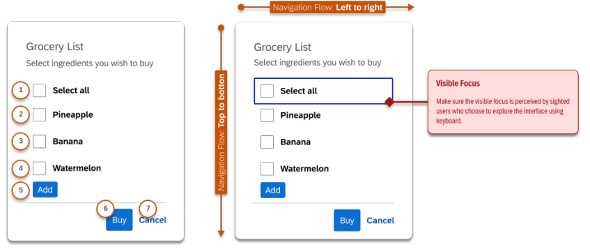
Annotate the Interactive Experience
The interactive experience is used to observe the needs of people with limited mobility. It covers the keyboard usage, but also considers the experience across multiple devices where mouse and touch are required to perform the interactions.

Annotate the Cognitive Experience
Neurodivergent people and those with cognitive limitations are supported through design choices such as clear wayfinding and orientation, effective error handling, flexible time limits, and reduced reliance on memory or repetitive input.
While some of these considerations align with AAA-level accessibility requirements, they can also be understood as essential reminders of what a truly comprehensive, usability-driven approach looks like.


Cognitive Experience annotation example for error handling
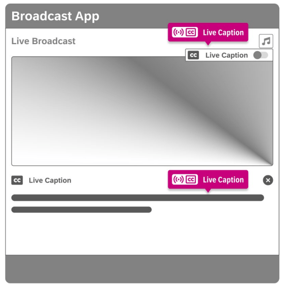
Annotate the Auditory Experience
Products that rely on sound to convey information, such as video training, audio instructions, or alerts, must provide alternatives for people with limited or no auditory access.
Common and effective alternatives include captions and transcripts, made available in sync with the associated visuals, so information remains accessible regardless of how it’s perceived.

🎯 The outcome: Accessibility Specification that Work
Inclusion isn’t about doing more work. It’s about tailoring the experience to different user groups, intentionally and early.
When teams share a common language around inclusion, high-risk moments in the product journey become visible. Not in theory, but in context, where users could hesitate, get confused, make errors, or are blocked entirely. The accessibility specifications is the key to achieve a successful inclusive experience.
Rather than abstract principles or ambiguous guidelines, accessibility annotations translate insight into concrete, actionable decisions. They clarify what needs to change, why it matters, and who is affected, helping teams prevent barriers instead of reacting to them later.
The shift-left doesn’t happen in isolation. It happens through group work, where multiple perspectives surface blind spots that no single role can see alone. If used consciously, the suggested checklists can cover over 80% of WCAG standards – this includes static interactions within UI components and long journeys across multiple pages.
Key deliverables are: Annotated UI elements, Annotated screens, and Annotated flows
Risk assessment
Accessibility is a shared responsibility across product, design, research, business, and engineering. But designers sit at the frontline of inclusive decision-making. Design choices shape structure, flow, interaction, and meaning, long before code is written.
That makes designers not just contributors, but key decision-makers of the inclusive experience.
Once the accessibility specs is created, a11y experts can review the annotations and raise potential barriers and blockers. If issues are raised, all roles should align and agree on how to prioritize the fix: immediately or int a future release. This strategy creates a shared ownership with clear responsibility and prioritization.
If you’re building digital products and want inclusion to be designed in, not patched later, structured group work is where the real shift happens. It’s how accessibility moves from intention to specification, and from principles to lived experience.